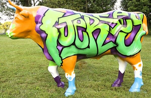
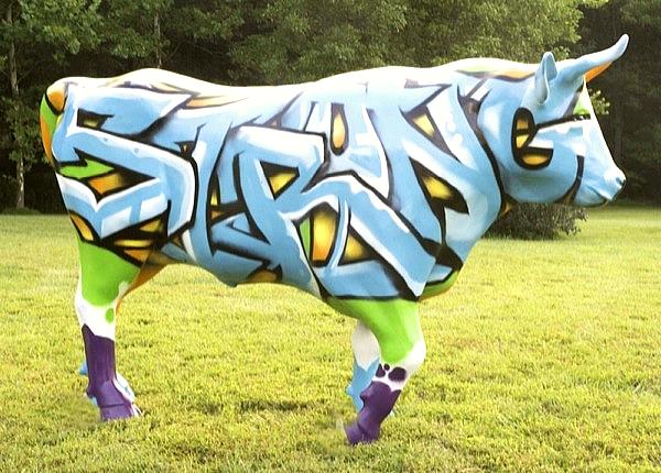
Jersey Strong (as an Ox)

The “Jersey Strong (as an Ox)” design is a play on words combining the “Jersey” Strong Slogan that was recently used as an rallying cry post-Hurricane Sandy in New Jersey with the cliché “Strong as an Ox”. I took the style energy and colors of graffiti tied to the slogan Jersey Strong to give it a new narrative. From a design standpoint the design is a perfect harmony of warm and cool colors. Each side uses the exact same colors and similar lettering to tie both sides of the ox together.
The word Jersey and the state’s silhouette is filled in greens to represent “The Garden State.” I used the purple dimension and warm orange backsplash to set the green piece off the background. I added strategically placed cyan chips to move the eye to other parts of the ox.
The Strong is basically the exact opposite of the Jersey piece. It uses blues in the fill of the piece to represent the shore. The orange dimension and green black splash helps to give the piece depth. The purple chips finish the “Strong” design.
The design is “Jersey Strong”…are you?
via Hopewell Valley Stampede Site

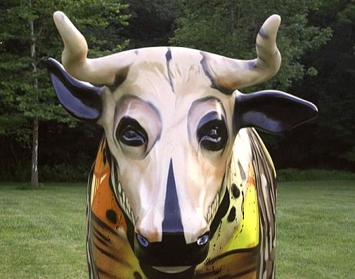
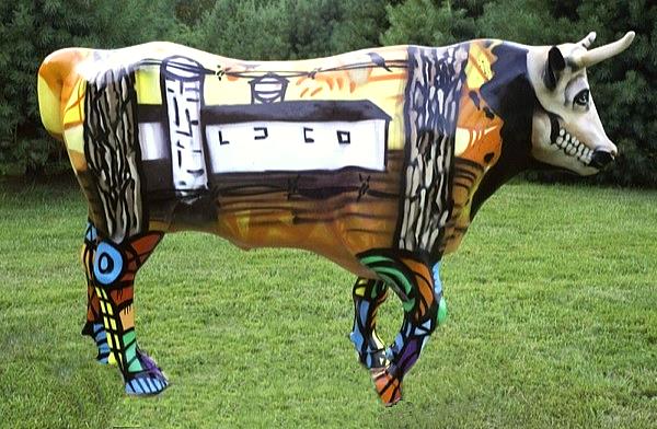
Inside Ox


The “Inside Ox” piece shows what the ox’s view could be on a farm. This piece incorporates a warm abstract design in the background and black and white foreground images. This helps to give the imagery in foreground importance.
I chose to paint the skull of the ox to literally show “inside ox”. The birds on the barbed wire fence represent the viewer of the farm. The legs are in opposite colors to help separate them from the rest of the design. In this design I combine an urban style with rural imagery to make the design interesting and current. This design asks the viewer to go inside of themselves to see “Inside Ox”.
via Hopewell Valley Stampede Site